It's All Good in the north-west as Tank & Skinny's celebrates the opening of its newest coffee shop in Derry with a new identity that places its two owners front and centre and a brand personality that’s honest, authentic, friendly, accessible and non-pretentious.
The Background
Tank & Skinny's, a family-run café business, proudly operates in four locations across the North West. The Doherty brothers, Ed and Shane, have crafted a warm and inviting experience, offering exceptional service and delectable cuisine – café culture at its finest. Ed and Shane started their first venture in 2010 and felt that it was time to take a breath, review the brand and improve it visually. Tank & Skinny's is renowned for its genuine, approachable, and down-to-earth brand personality, which is evident in all their establishments and across their vibrant social media platforms. Our mission was to infuse the visual brand with an even greater sense of authenticity and friendliness, starting with a captivating logo and extending it to a comprehensive graphic language.
The Idea
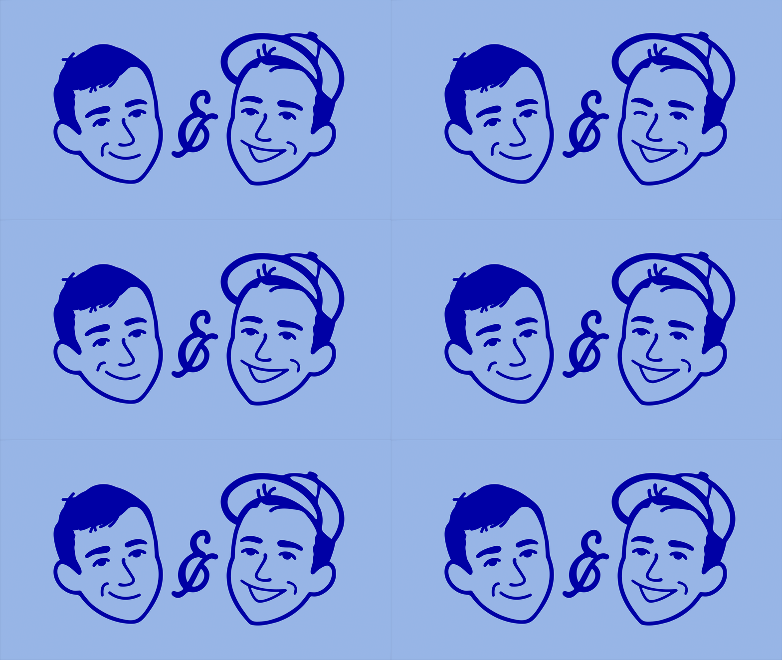
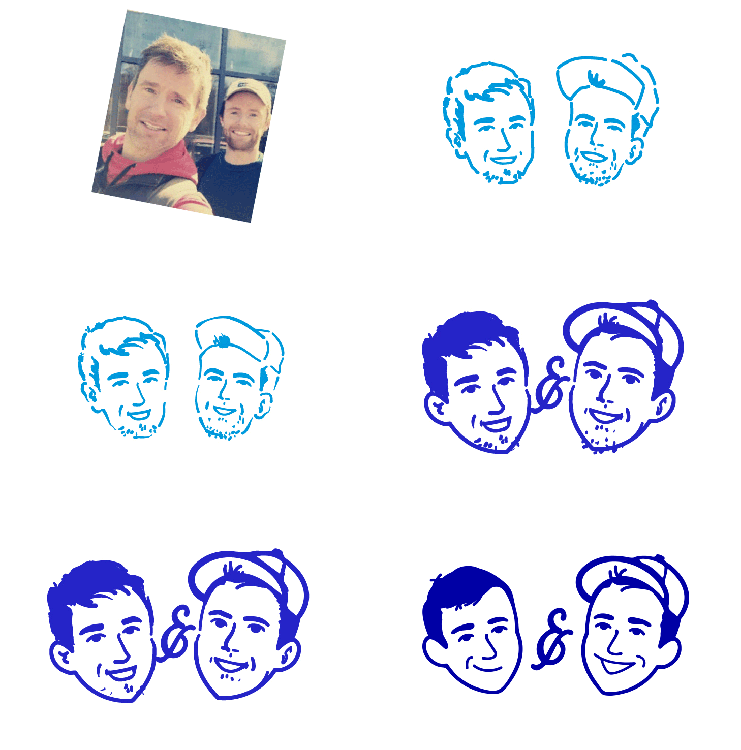
Tank & Skinny's were keen to maintain a monogram in their brand, so we designed a new monogram that reflects their shops' personalities. We also created a delightful illustration of the two brothers, adding a friendly face to the brand. This illustration can be used in a versatile and dynamic manner alongside other brand assets, ensuring a playful, fresh, and personality-filled experience. To enhance the overall cheerful personality of the brand, we included the tagline "IT'S ALL GOOD" and typeset it in a friendly configuration. The brand's colour palette revolves around a vibrant reflex blue, complemented by a carefully curated selection of powder blue, dusty pink, lemon, and light grey. These colours form a cohesive visual foundation for the brand's identity.
The Execution
We selected an accessible sans-serif font that suggests a human touch and possesses unique quirks that convey a sense of friendliness through typography. Moreover, we developed a straightforward dot pattern that can be flexibly employed in various sizes as part of the overall visual language system. Elsewhere, we seamlessly incorporated these distinct elements across a range of materials, including coffee cups, food packaging, napkins, menus, uniforms, and signage. We also created assets and avatars tailored explicitly for their social media accounts, aiding them in refining their online presence.


