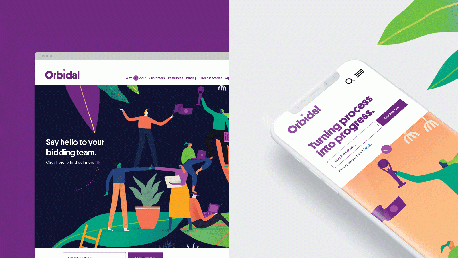
A new name and identity for Tenderscout, an up-and-coming start-up that found itself at a critical transition point towards becoming an established business.
The Background
Tenderscout found itself at a critical transition point with an overarching goal to grow its revenue to €50m by 2025. While developing a strategy that would give them the credibility to compete for multinational business globally, they decided they needed a new brand identity.
The Idea
There were two parts needed for the design solution. First, the new identity must reflect the positioning and the narrative and be global. It had to give Tenderscout credibility to compete for multinational business in any market.
The second part was ensuring it was differentiated from its marketplace and competitors. Companies within this space tend to be somewhat cold and generic. They lack customer empathy (the human touch) and generally comply with the given semiotics of the category, which does little to differentiate what the company does or how it does business.
The Execution
Our first project task was to carry out research and competitive analysis before designing and facilitating brand workshop sessions with their team. At these sessions, It soon became apparent that Tenderscout’s name was no longer fit for purpose. Through a thorough naming process, the name ‘Orbidal’ was agreed upon.
The next step was to express the new name and positioning with a new identity. There were a number of different target audiences to consider - professional services, owners of companies and enterprises. All people with tendering experience recognise the pipeline and the potential opportunities it presents. They had to instantly identify what Orbidal stands for and how they can help.
A new logotype emerged quickly, giving Orbidal a simple yet bold mark that applies well digitally, which is crucial for a SaaS solution company. The concept behind the logo is that the ‘i’ in Orbidal is the user at the centre of a celestial partnership between the platform, the process and the positive results that Orbidal strives for. All are on a trajectory to create opportunities and foster genuine working partnerships.
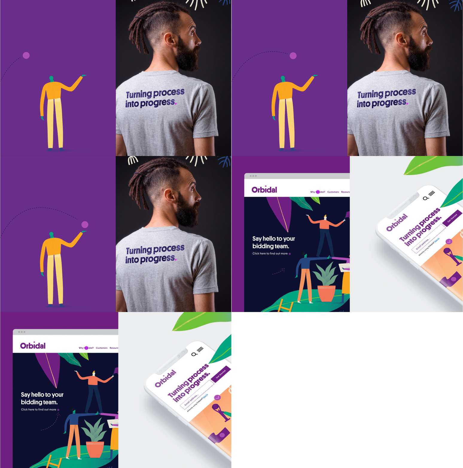
We collaborated with Mark Conlan on a series of beautifully crafted illustrations to bring things back to earth. While a lot of the iconography that Orbidal’s competitors typically use can seem off-the-shelf and impersonal, we worked with Mark on introducing a human touch to the identity. The style focuses on creating a narrative through the strong use of character and composition, empowered by whimsical yet emotionally relevant situations. Meanwhile, the vibrant colour palette completes an identity for a marketplace that is supported through collaboration, discovery and determination.


