


Universal Music Group is the biggest record label in the world and home to a diverse roster of artists across an iconic array of labels. UMUSIC, the business-to-consumer side of the business has been around for 10 years. So too had its logo. That’s why Universal Music Group approached us about a new visual identity for the UMUSIC brand, one which could help stamp its mark on the next decade.
The Approach
The music industry has undergone seismic change in the last 10 years. So much that the existing UMUSIC logo was no longer fit for purpose. It had become outdated, lacked impact and just didn’t express the fun personality and core essence of what UMUSIC was about.
Our objective was to develop a new visual identity which would resonate with the target audience and work across the various, primarily digital touchpoints. With the team at UMUSIC pushing out a huge volume of fresh, engaging content in a crowded space, the goal was strong differentiation and brand attribution.
The idea
From all our research and work with the client, it soon became apparent that what this brand needed was flexibility. It needed something that would work anywhere, on any platform or device, and would be very fluid. The one thing it was never going to be was a static logo with colours that would appear the same way on everything.
The Execution
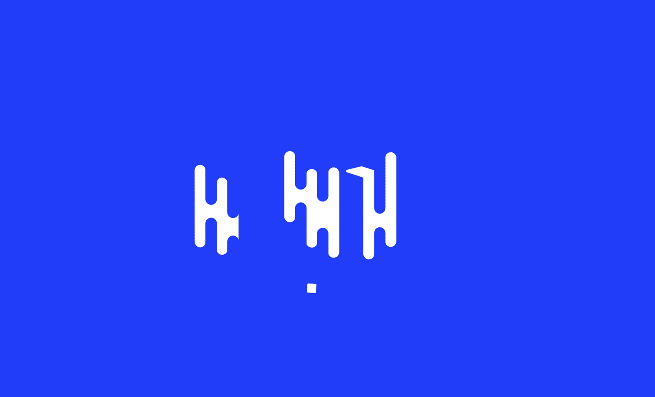
The inspiration for the UMUSIC mark was to pay homage to the golden age of music television - the era of MTV. We felt that, for a generation, that design summed up how people engaged with music. The embracing of the digital age is undoubtedly the next big thing in music engagement - so, we wanted to create something bold, iconic and identifiable.
This was supported by a visual language which was inspired by the idea of listening to music and the idea of soundwaves, adjusting sound levels, recording music - the visual representation of sound.
This created a very flexible visual language that worked in both its static and motion forms. It allows each piece to be dynamic and shape-shifting, freeing UMUSIC’s design to literally move with the times.
Combined with a strong colour palette optimized for screen use and a contemporary font – Boing – chosen for its subtle curves reflected in the logo, the visual language sets a friendly and approachable tone for the audience.


Cian McKenna (Motion Design)
If you would like to chat about a creative project, we’d love to meet you. Our door is always open here at Ely Place.
Contact UsAddress
22 Ely Place, Dublin 2
D02 AH73, Ireland
Join our Mailing List

